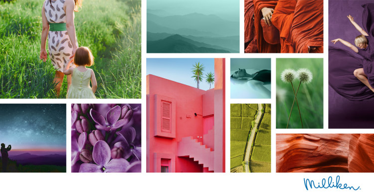
As togetherness and context become increasingly important trends for both society and industry, through its ColorDirection 2021, Milliken & Company has embraced colors and textures that complement each other to reflect these vital values.
Humans are visual creatures and color plays a key role in purchasing decisions through effective branding and personalization. Milliken’s 2021 range contains strong and bold tones from across the spectrum offering brands and product designers seven new color trends shaping tomorrow’s consumer product space.
In the midst of the global challenges of 2020, these hues are thematically rich and work together in harmony, enabling a visual flow, as people look to choose colors that offer them reassurance and help them to find their place in the bigger picture.
From the dark richness of a distant galaxy’s planetary swirls and illuminating contours, to the wonders of living structures and patterns within, for example, simple houseplants, these natural designs, similarities, connections and contrasts can be found all around us. Milliken’s 2021 color collection make these colors rich and visible in Harmonic Synergy.
- Summer Dawn is a vibrant orange/red energizing the morning sky, lighting the equally alluring warm colors of the smooth contours in rocks formed over millions of beautiful sunrises. It’s also the color charged with the power of a day filled with texture and possibility, swelling in warmth and fizzing with visual energy.
- Soothing Earth is a smooth green grounded in the textures of natural patterns on our planet’s surface. It is a journey into quiet and calm that reminds us of treasured days in open fields with nature’s warm embrace.
- Forest Walks is a deeper, rich green at peace with the environment and surrounded by the clarity and support of the natural world. It is a rich signal color with strength and depth; a classic choice made new with the subtle power of a darker tone.
- Majestic Skies reaches deep into the spectrum for a bold and confident blue. It is a bridge between the fragile world of human industry and the stretching cosmos beyond. Inspired by the rich hues of unfolding galaxies, this color is ideal for products looking to connect the everyday with the bigger picture.
- River Calm is a sparkling ocean tone with an airy lightness. The color is visually nourishing, bright without sharpness and strong without shouting. It brings attention to its message of connecting with the waters of life.
- Floral Song brings blossoms and laughter together in a delicate bouquet of grounded notes and confident optimism. A deep, warm and satisfyingly rich purple the color speaks to natural tones that connect and inspire.
- Proud Rose is a stunning, deep pink that is vibrant and unafraid, bringing an unmissable character of bold beauty to our color palette. It is a perfect choice for any product that needs to stand out in the crowd and bring new life to the eyes.
These seven trend colors, that make up the Harmonic Synergy palette for 2021, provide design inspiration and a marketing roadmap to help build the ultimate customer color experience, and can be sourced through Milliken’s globally leading colorants.
These include Liquitint colorants tailored for multiple applications, including laundry detergents, household cleaners, fabric softeners, and other household and industrial products and Liquitint Agro colorants for the agricultural sector. Milliken’s ClearTint colorants for NX UltraClear polypropylene offer the clearest and brightest colors for transparent polypropylene and are compliant with safety requirements for food packaging, whilst Reactint polymeric colorants for polyurethane (PU) add vivid, appealing color to products without affecting the physical properties of the material. Milliken’s KeyPlast® line is a plastics and packaging trendsetter when it comes to colorants. It is available in a range of stable and reproducible colors - and includes colorants for food-contact applications in PET.


